Your Wall Sets the Rules: Judging Window Proportions Before You Sign
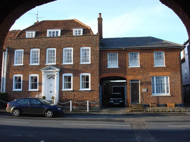
Photo: Oxyman, CC BY-SA 2.0, via Wikimedia Commons
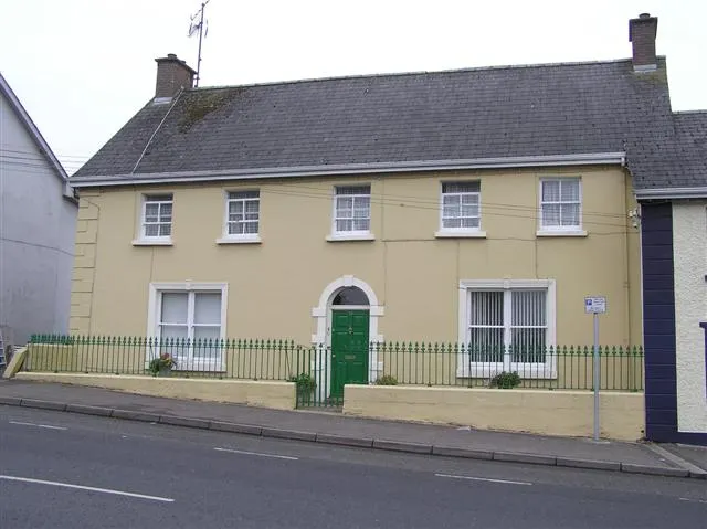
Window catalogues are terrible liars. They show a perfect frame floating in a white room, with no brickwork, no gutter, no neighbouring windows and definitely no British drizzle. On a real street, a window is judged by how it sits in the wall. That is why proportions deserve your attention before you fall for a style name.
At Clearvue Windows, we see the same pattern in quote conversations. Homeowners arrive with a favourite look, then discover the opening is narrower, the reveal is deeper or the neighbouring windows set a rhythm that a different product would break. None of that means the style is wrong. It means the proportions have to be checked first.
The opening is the real starting point
A window is not just a frame and some glass. It is an opening in a wall, a set of visible lines, a reveal, a sill and a relationship with everything around it. Change the frame width and you change how much glass you see. Move a mullion and you change the view. Push the frame further back into the wall and you change the shadow line across the facade.
The eye reads these things long before it reads a product brochure. A wide, low window on a narrow terraced front can look stretched. A tall sash-style window with a heavy meeting rail can feel cramped in a shallow room. A flush casement with slim sightlines can look beautifully calm on one elevation and strangely thin next to a chunky bay. The point is not to memorise rules. It is to compare the window as part of your wall.
Frame-to-glass ratios: the number the brochure leaves out
Ask any window supplier for the frame width and the visible glass area, not just the overall window size. Those figures tell you more about the finished look than a glossy photo ever will. A chunky frame eats into the view. A very slim frame can maximise glass, but it may also affect strength, insulation and where locks and vents can sit.
The practical move is simple. For each quote, note the overall width and height, the frame width at the sides and head, and the visible glass width and height for each pane. Then compare. A window with the same overall size can deliver noticeably different sightlines depending on frame design, opening style and hardware. If a trickle vent or a handle sits right where you planned to look out, that matters too.
Mullions, transoms and the grid you actually see
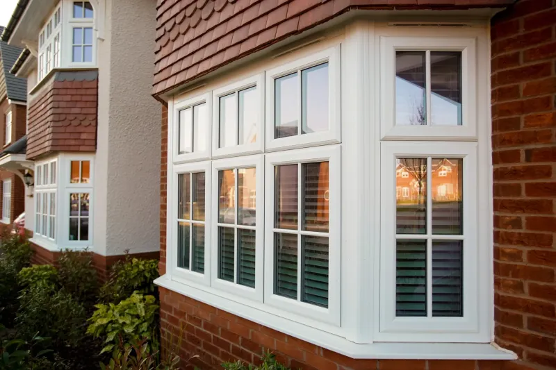
Mullions and transoms are not decoration added at the end. They are part of the composition. A single vertical mullion can make two tall panes feel elegant or make a small room feel like a pair of narrow slots. A horizontal transom can line up with a neighbouring window head, or it can cut across a view for no useful reason.
Glazing bars deserve the same scrutiny. Some are internal, some are external, and some are stuck on. They can mimic a period look, but they also add visible frame area. On a cottage or a conservation-area property, that may be exactly right. On a modern extension, a grid of bars may fight the clean lines you wanted. Compare the actual bar width and position, not just the name of the pattern.
Reveal depth and the shadow line
The reveal is the return between the outer wall face and the window frame. It is easy to ignore until the window is fitted, when it becomes one of the most noticeable things about the elevation. A deep reveal gives a window a sheltered, solid look. A shallow reveal makes it sit closer to the brick face. Neither is automatically better, but the choice changes how light enters the room and how the facade reads from the pavement.
Ask where the frame will sit within the wall. On a cavity wall, that position affects the sill, the lintel, ventilation and weather detailing. In a conservation area or a period property, it may also affect what is acceptable. The question is not just 'which window?' but 'where in the opening?'
Paper mock-ups that beat showroom lighting
You do not need software to test proportions. Cut lining paper or cardboard to the exact opening size and tape it to the wall. Mark the proposed frame width with painter's tape, then add tape lines for mullions, transoms and glazing bars. Step back across the street, photograph it from eye level and look at it from inside the main room. Repeat for the second option.
This is crude, and that is the point. Showroom lighting flatters everything. Your street, your brickwork and your sofa do not. Try the mock-up at different times of day. Check how the window lines relate to the door, the gutter, the neighbouring windows and the sill course. If one option looks calmer from the pavement, that is useful evidence.
A proportion checklist for your quote
Before you sign, ask for these details in writing:
- Overall window width and height, plus the number of opening lights.
- Visible glass width and height for each pane, not just the whole window.
- Frame width at sides, head and sill, and the width of meeting stiles.
- Mullion and transom positions in millimetres from the frame edges.
- Glazing bar width and whether the bars sit inside or outside the glass.
- Reveal depth and the planned frame position within the wall.
- Sill projection and how the window head meets the lintel or surround.
- Trickle vent size and position, plus any opening limits or handles.
- Alignment with adjacent windows, including heads, cills and spacing.
- Any planning or conservation-area constraints affecting proportions.
A good quote should survive being read as a drawing. If the supplier can show an elevation with sightlines marked, so much the better. That is the version of the window you will actually live with.
Style still matters, of course. It just should not be the first decision. Start with the opening, the wall and the view. When the proportions are right, the style has a much better chance of looking as though it belongs there.